1. Which assignment did you ENJOY working on the best? Why?
I enjoyed working on the mask assignment the best because it was fun, different, not something you would think you would be doing in college and I felt like a little kid again making arts and crafts.
2. Which assignment did you ENJOY working on the least? Why?
I enjoyed working on the art exhibition project the least, because I thought that project was the hardest, took the most thought and time. I also got frustrated when I forgot information about the pieces and had to go back and find the pieces all over again.
3. How did you like using ANGEL?
I like using angel, I understand angel more now after taking an online course than I thought I ever would. It is much easier to use than I thought. I really liked how organized everything was, and I knew when everything was due. I could also get ahead certain times if I wanted to or had time to.
4. If you had the opportunity to change this course:
What would you keep?
I would keep the extra credit opportunities, such as this one. I wouldn't add anymore extra credits because the students who don't do their work shouldn't get the opportunity to get their points back for skipping an assignment. I think you offer the right amount of extra credit for students who didn't do so well on an assignment and can get their points back for that reason. I would also keep, where you offer students to turn in work late with permission. Some professors refuse to offer that regardless the situation and I think that is wrong because students go through hard times and sometimes they have trouble completing all the work. Although, I would not let students take advantage of this.
What would you remove?
I would remove the part where you have to respond to two others in the discussion forum. I don't think anyone even reads the responses, because I know I rarely ever did.
What would you add?
I would make the students upload a photo to their blog. I never knew who I was talking to and sometimes I wasn't even sure if it was a male or female because some names can go both ways.
5. Would you recommend this course to your peers?
Yes I would definitely recommend this course to my peers, one of my peers actually recommended this course to me, and I am glad I listened to her. If you have the time and can keep on track with turning things in on time, I would say its definitely worth it.
6. Please list any other comments you would like to share.
Great professor, grading is fair and even without being in class, i've learned a lot from the book and assignments given. I definitely did not waste my time taking this class.
Friday, May 10, 2013
Reflections of AED 200
1. What were you expectations for this course and where they met?
My expectations for this course were to learn some things that I have not yet learned about art such as the history and background of art. These expectations were definitely met. I have learned about how cultures have different art. I learned about cave art, gothic art, and all the different art styles and themes.
2. Now that you've been through this course, What is art? How would you define it now compared to your initial posting?
After being through this course, I still would have my definition of art; to take your feelings and put them onto paper. But I would add to it that art is a way to tell a story and to show your culture through images.
3. Who was your favorite artist in your original posting and who is your favorite visual artist now? If there is a difference, why do you think so? If you have the same favorite artist, why do you think so?
In my original posting I said that I didn't have a favorite artist, but when I usually have to pick one I chose Leonardo Da Vinci because I know him the most and know he created the "Mono Lisa." After this course, I would still say the same thing. But if I could choose myself, I would do that as well, because I am the only person who will be able to create art the way I like it, with my own interests and feelings.
4. Now that you've completed this course, how do you feel about taking an online course? Is your answer the same as it was in your first posting? How is it the same or different?
This was my first online course, I will say it is a lot of work but I enjoyed it. I enjoyed being able to work around my schedule and completing things when it best suited me. I have actually registered for two online summer classes, and I have always told myself I would never take classes during the summer. I am also registered for two online fall classes as well as the rest of my classes that I will be taking at Buffalo State. I am glad I took this course and succeeded at it. I think it made me more organized and made me pay more attention to when things were due and I had to plan accordingly.
Self-Portrait

Self-Portrait in a Straw Hat
Paul Cezanne
The Museum of Modern Art

Charles Willson Peale Self-Portrait
National Portrait Gallery

Portrait of a Man (Self Porrait)
Jan van Eyck
Cooper-Hewitt, National Design Museum


The first inspiration piece I chose was "Self-Portrait in a Straw Hat," by Paul Cezanne. I chose this piece because I like how Cezanne left brush strokes in painting, indicating that the picture can still be "good" even if it doesn't look like a photograph. The second piece I chose was "Charles Willson Peale Self-Portrait." I chose this piece because it is an example of a painting that actually does look like a photograph. I thought it would be a good idea to look at an example from both sides. The third inspirational piece I chose was "Portrait of a Man," by Jan van Eyck. I chose this one because it was created with a unique medium; silkTechnique: jacquard woven. I thought the medium of the piece made it interesting. I selected to use charcoal to create my piece because I think when drawing people, charcoal tends to give me the best results. When creating my self-portrait, originally my mouth looked like it was making a weird face and not smiling. I didm't realize how bad it was until after taking the picture and so then i went back, erased it and redid the whole mouth. This piece represents me because I'm a happy person and I'm always smiling, and I have a huge smile in the portrait. I used line in my portrait in the hair and the hoodie I am wearing. Value is also used in my portrait, the lights and darks in my hair and face. I enjoyed working on this project because I thought it was fun to try and draw myself. I did get a little messy though using the charcoal. I felt like I was a little kid again. I think my final artwork came out okay, I think my face came out a little too ovalm it should have been more round. It does't look exactly like me but if you compare it to the photograph, you can see the comparison. You can definitely tell this is a person which is the most important part.
Art Criticism Article Reflection Journal
The projects I reviewed were, "The Beauty Of a City by Brandon Martens, "Stories and Histories of Ancient Cultures" by Dimitar Vanev and "Reality Unhinged" by Jeffery A. Wilcox. I chose the exhibit I critiqued, because even though I hate history, this project was the most organized and well put together of the ones I viewed. The structure of this project really caught my eye. When writing the critique article, I realized if I continued writing at the rate I was, then I would exceed the three page maximum. I overcame this problem, by talking about the extra slides Vanev included in his exhibit as one whole slide because they were all basically the same type of pieces. I thought it was interesting to critique my peers work, and see what other students have come up with. But I also felt like I could not say anything bad about it because I'm sure this person spent plenty of time on the project and I don't want to criticize what they've done. Even though the project was great, nothing really bad to say about it. Yes, I would like to read the critique my peers wrote about my project, it would be nice to hear from someones point of view other than the professor. On a scale of 1-10, I would rate my article a ten, because I followed all the directions and included everything I thought would be helpful to improve Vanev's exhibit. I spell checked the article and put a lot of time and effort into it. I both enjoyed and hated this project at the same time. I enjoyed it because I am good with powerpoint and making slideshows, and because I am good at it I enjoy doing it. I hated it because it took up a lot of my time and I found it more difficult than any of the other assignments we had throughout the semester.
Wednesday, May 8, 2013
Week Fifteen- Video Review Blog
1. For each video list/discuss the key concepts you learned.
The Colonial Encounter: View of Non-Western Art and Culture
-1900s Paris worlds fair was the largest world fair with over ran for 8 months
-over 50 million visitors.
-Exposed the the underlying nationalism of the event.
-Half the area was devoted to French imperialism while the rest represented other nations' colonies.
-Three figures from the fair represent three kings of the 19th century. They remain on exhibit today.
Jackson Pollock: Michael Fried and T.J. Clark in Conversation
-Both regard Jackson Pollock as a major modern master
-This conversation took place in National gallery of art in Washington.
-This film is the two men T.J Clark and Michael Fried giving their own thought objective description, analysis and interpretation on Pollocks work.
-Clarks emphasis is on the historical role of modern art while Fried is focused on the independence of its aesthetic.
2. Do the videos relate to the creation of your Art Criticism project? If yes, explain how. If no, explain why not.
The film "The Colonial Encounter: View of Non-Western Art and Culture," relates to our project, because the worlds fair is an exhibit of art pieces from across the world. The film "Jackson Pollock: Michael Fried and T.J. Clark in Conversation," relates to our project, because the men are giving an art criticism of the Pollocks work just as we did for each piece in our exhibition.
3. What is your opinion of the films? Do they add depth to understanding of art criticism?
The film "The Colonial Encounter: View of Non-Western Art and Culture," goes in depth and talks about the important piece of the worlds fair. I found this video interesting because I have never even heard of the worlds fair before watching this. The film "Jackson Pollock: Michael Fried and T.J. Clark in Conversation," goes into depth on Pollocks piece, and talks about every detail. Helping you clearly understand how to arrive at an objective description, analysis, and interpretation of a work of art.
Project 4: Art Curator Exhibition Reflection
I both enjoyed and hated this project at the same time. I enjoyed it because I am good with powerpoint and making slideshows, and because I am good at it I enjoy doing it. I hated it because it took up a lot of my time and I found it more difficult than any of the other assignments we had throughout the semester. It didn't take me too long to come up with a theme. But selecting which photos to use was a process, and then finding all the information I needed for each piece was difficult. All my pieces ended up being photographs of architecture, therefore the size was difficult to find, all I could find was a "download size." Then for the year, I wasn't sure if I would use the year the building was made or the year the photo was taken because I was focusing on the architecture, not the actual photo itself. I was very confused, but after finding all my photos I didn't have time to select a new theme so I just worked with what I had. If I knew the information I included it for both the photograph and the building itself. But I had to do a little research on finding that, which took more time. Then I forgot to include the source, so I had to go back and find each piece again to find the source. But overall I am glad to finally complete the project, and I am looking forward to what my other classmates have come up with.
Wednesday, May 1, 2013
Module 13 & 14 Video Review
1. For each video list/discuss the key concepts you learned.
The Lowdown on Lowbrow: West Coast Pop Art
-Lowbrow: A person regarded as uncultivated and lacking in taste.
-Initially it was used to images containing naked women.
-Originally meant pornography.
-Has a history in folk art
Displaying Modern Art: The Tate Approach
-The most popular museum of modern art in the world.
-Many abstract artists consciously tried to make paintings that were not dependent on figuration. They wanted to convey emotions, aesthetic effects or a social vision through formal means that were not reliant on external references.
-The displays are geared to make sure no one ever gets bored.
-Moving from room to room is like switching channels on a television.
-The organization/ arrangement of pieces is important as well as the architecture of each room.
Bones of Contention: Native American Archaeology
-Over the past 150 years, the bones of tens of thousands of American Indians have accumulated in the name of science.
-These bones are kept at archaeological sites across the U.S and are in the possession of Museums and the Native Americans want their ancestors back.
-Laws were being passed protecting Indian burial sites.
-The Indians feel that they are less than human because their ancestors are treated this way and their bones can be dug up.
An Acquiring Mind: Philippe de Montebello and the Metropolitan Museum
-Knowledge is the engine that makes museums work.
-Interesting thing about art museums is that they are never finished.
-Philippe de Montebello, served for 31 years as Director of The Metropolitan Museum of Art.
-8th and longest server director
-Guided the acquisition of more than 84,000 works of art.
-Born in France, Educated in Harbor.
-de Montebello says that 100% of what the public wants to see is on display at the Metropolitan Museum at all times.
2. Do the videos relate to the creation of your Art Exhibition project? If yes, explain how. If no, explain why not.
Yes, the videos related a lot to the creation of my art Exhibition project. The videos were all about museums, how work is arranged, and the videos talked about the architecture of the museums which is my theme. Architecture.
3. What is your opinion of the films? Do they add depth to the understanding of the art concepts you practiced while creating your curation project?
I think the films went in depth on how to arrange your art in your exhibition and the importance of the walls and the room itself where each piece is kept. This helped me chose which pieces to use and how to arrange them in my exhibition. I think these videos were very informative and helpful to each person for this project in a different way depending on the theme they chose.
Monday, April 22, 2013
Module Twelve- Blog: Video Review
1. Explain why you selected each of the TWO videos you choose from the selection listed above.
I selected the two videos I did because I realized that I enjoy the videos on one person more than the videos on one topic. Therefore I chose the video "The Art of Henry Moore" and "Andy Warthol: Images of an Image."
2. For each video list/discuss the key concepts you learned.
In the Video "The Art of Henry Moore," I learned that Henry Moore:
-Was one of the greets artists of the 20th century
-Explored human figure and natural forms in sculptures and drawings.
-The first series woodcarving he did was the roll of honor for the secondary school at Castleford
-He was in the army from 1916-1918
-He received an army grant which enabled him to go to Leeds School of Art.
-Early Mexican Art formed his views of carving.
-His art piece "The Warier" was created because of a pebble he found on the seashore in 1952 that reminded him of a stump of a leg amputated at the hip.
-No stone figure can stand on its own ankles, but bronze has tensile strength.
-Bronze lasts longer outdoors than stone does.
In the video "Andy Warhol: Images of an Image," I learned that
-He never wanted to be an artist, he always wanted to be a tap dancer.
-After Marilyn Monroe's death, he created a piece with the repetition on Marilyn's face. Marilyn's face made Warhol famous.
-Screen was originally made of silk, but it is now a finer material of fine or coarse mesh, depending on the desired effect.
-He was obsessed with repetition.
-His studio became the hangout of New York Artists.
-In, 1963, he bought a movie camera and shot about 10 films and turned his friends into movie stars.
3. How do the videos relate to the readings in the text?
The text has a whole page about Andy Warhol and basically the same information. The video just goes more in detail, expands more and shows many more images. The text doesn't say anything about Henry Moore, so the video was a great amount of information to learn.
4. What is your opinion of the films? How do they add depth to understanding of the readings and art concepts?
In my opinion, the films taught me a lot. Especially about Henry Moore because the book left him out and therefore without the video, I would have known little to nothing about him. The Andy Warhol video just expanded on what I learned from the book.
Friday, April 19, 2013
Art Gallery Visit 2
Step 1: The Exhibition
1. What is the title of the exhibit? Burchfield Penny Art Center
2. What is the theme of the exhibition? Western New York
Step 2: The Gallery
1. What type of lighting is used? Accent Lighting.
2. What colors are used on the walls? The walls are white, yellow, blue or green throughout the Burchfield Penny Art Center. For "A Case Study of Transference," the room is completely black with light shining only on the exhibit.
3. What materials are used in the interior architecture of the space? Wall layering, oddly shaped walls, tall ceilings, a round room are all parts of the interior architecture of space.
4. How is the movement of the viewer through the gallery space? The movement of the viewer through the gallery space is almost jagged in some spots and open in the others.
Step 3: The Artwork
1. How are the artworks organized? The artworks are organized by their media, mediums and how they are framed.
2. How are the artworks similar? The artworks are similar, because they all have a relation to Western New York.
3. How are the artworks different? The artworks are different because they include artists of different media, periods, and career development. They vary in size and formats. They all have a different meaning and are all unique in their own way.
4. How are the artworks framed? Some of the artworks are in a completely black room with light shining only on the art piece which make the walls appear to be black, and the piece look like it is glowing and floating. Some are framed in a frame inside of a glass frame. Some are framed in a wooden, metal, or black glass frame with a border around the piece. Some are framed in a display case with usually a white, black or yellow bottom. Some aren't framed at all.
5. How are the artworks identified and labeled? The artworks are identified and labeled with a white board on the wall next to them stating the title, artist, date, media, size and some pieces even have a little bit about the piece underneath that.
6. What is the artworks proximity? There is a good amount of space between each piece. Some of the art pieces have their own walls and some art pieces are put together to form a display.
Step 4: Art Criticism Exercise
Artist: Xu Bing
Title of Work: A Case Study of Transference
Media: Inkjet Prints
Date: 2005
Size: 160x 14 inches

1. This art piece is very interesting, it looks like a sex piece but involving an asian man and a pig. The piece is located in a dark room making the walls appear to be black and light is shining only on the piece making it look like it is glowing. The piece also looks like it is floating being located in the dark room. I think the set up of this piece is very interesting.
2. I see a document of photos. In the photos are an asian mannequin and a piq. They are both covered in what appears to be tattoos. Each documented picture shows the mannequin and pig in different positions.
3. You will find rhythm in this art piece because of the repetition of the mannequin and the pig from each documented photo. There is light and dark values from the light shining off the mannequins skin to the darkness of his hair. Movement is represented with the mannequin and pig being in different positions for each documented photo. There is a variety of positions of the mannequin and the pig. The mannequin and the pig are very emphasized, because you don't really pay attention to what is happening in the background when you look at this piece, unless you are analyzing it. There is space between the bars on the fence in the background and line is also used in the fence.
4. This work reminds me of a Chinese restaurant. The tattoos looks like they could be Chinese symbols. The pig could symbolize food and the asian man working in the Chinese restaurant.
5. I think the artist was trying to show the different reactions the pig would have for the different positions of the mannequin. Although, I'm not sure why both the pig and mannequin would be covered in tattoos.
Artist: Bruce Jackson
Title of work: Lower Manhattan
Media: Photograph
Date: 2012
Size: Not Specified

1. I love this piece. It really puts me in a good mood, makes me feel as if I am the man taking the photograph. It looks as if he is on vacation and vacation is a relaxing time for people. Usually a person would take a picture of only the city, but he captured the city and himself in the same picture, which I think is very creative. I feel as most people would think if their reflection was in the picture, it was ruined. This man has a great mind.
2. I see a man taking a picture out of what almost looks like a hotel room of of the city below. The man is taking the picture through the glass and because the light is on in the room, you can see his reflection. Therefore, you see both the city and the reflection of the room in the glass in the same picture.
3. The lights in the city of the photo show red, orange, green, yellow bright colors and the reflection of the man and the room show more faded colors. The room has more of the light values in the photo and the being outside at night has more dark values. Even though its hard to see, the buildings in the city have form in their architecture. The inside of the room also has shape and form in the doorways and walls. This photo is very balanced with more if the city being on one side and the reflection of the room being on the other. The photo has unity, it looks complete. Your eyes will move throughout the piece looking back and fourth between the man and the city. There is also a variety of buildings you will find in the city.
4. This picture reminds me of Las Vegas. Even though the city below looks nothing like Vegas, the picture just reminds me of when I was in Vegas looking out of my hotel room and seeing all the pretty lights and also seeing my reflection in the window. Also the mans hair in this picture reminds me of Albert Einstein, the way it is sticking up in his reflection.
5. I think the artist was trying to justify, that you can be in two places at once.
Artist: Camp Fire Stores Company
Title of work: Sky Map
Media: Ink on paper mounted on card board
Date: 1917
Size: Not Specified

1. This piece is very creative, I would love to own one of these for myself. I can never find the stars and the constellations therefore a piece like this would come in handy. This was a creative way to make art into a useful tool.
2. I see a circle with dots inside representing the stars of installations. Then outside of that circle is cardboard labeled with the time of day, the cardboard looks like it can spin. Then outside of that piece of cardboard is another circular layer of the time of year. So you can spin the cardboard depending on the day and time and see the location of the constellations.
3. The dots indicating the stars is showing rhythm and giving a pattern. The piece looks like it has a smoother texture, maybe a little rough on the edges where it seems to have been worn. Your eyes will move from star to star finding the constellations in the piece. This piece is made with a few circles giving it shape. The proportion of this piece is much smaller than the real life start constellations. There is a variety of numbers throughout the edge of the piece. Line is used in these numbers. There is a lot of space between each dot indicating the stars on the piece.
4. This piece reminds me of the cross section of a tree trunk. When I first glanced at it from far away, thats what I thought it was. The colors are very similar to those of a tree trunk.
5. I think the artist was trying to show how you can locate the constellations at different times of the year and night, with just a simple tool like this.
Wednesday, April 17, 2013
Module 11: Video Review
1. Explain why you selected each of the TWO videos you choose from the selection listed above.
I was unsure of which videos to watch, so I watched a minute of each of them and the two that seemed the most interesting to me were the two I chose. "Matisse and Picasso" and "Dance at the Moulin de la Galette" either had the best narration or something interesting that brought me to them.
2. For each video list/discuss the key concepts you learned.
In the film "Matisse and Picasso," I learned that the relationship between Matisse and Picasso was unique. The stein family was the only people interested in Matisse's painting of his wife, and they bought it. The First Matisse was hung up and later surrounded by Picasso's paintings. Gertrude Stein thought the two should meet. He was the first to recognize the greatness of Matisse and Picasso. Picasso's father was a painter and a drawing teacher who encouraged his talent. Matisse was stubborn, unaware of his talent for 20 years of his life. When they met there was no clash, but they exchanged paintings. In 1912, Picasso invented his first collage. He was the team leader of cubism and Matisse was furious. Matisse is deliberate, rational and very French in the way he organized his thoughts. Picasso is a worker, impulsive and immerses himself in his painting. The outbreak of war did not stop them from painting.
The film "Dance at the Moulin de la Galette," talks all about Renoir's famous piece. The piece was the most joyful and celebratory painting in art history. This painting transports us the viewer back in time to Paris. But also brings Paris to us. This was one of the most controversial paintings in the world. Renoir painted it twice almost changing nothing but its size. He wanted women to look beautiful and the men to look interested in the women. Which was a great statement of sexuality and thats why the painting is so famous. This is one of the greatest constants of human existence.
2. How do the videos relate to the readings in the text?
Both the videos and the text go into detail about Henri and Matisse. But the video goes more in depth on how the two relate and what pieces they were both working on at the same time. Both the text and the film go into detail of Renior's "Le Moulin de la Galette." The video is able to show more zoomed in areas of the piece and explain the part by part as in the book it talks about the piece more as a whole.
3. What is your opinion of the films? How do they add depth to understanding of the readings and art concepts?
I think the films go very far into depth in explaining Matisse and Picasso's relationship and the painting "Dance at the Moulin de la Galette." I learned a lot that I didn't know about these subjects just from watching the videos. I highly recommend these for future classes.
Friday, April 12, 2013
Module 10 Blog
1. Explain why you selected each of the TWO videos you choose from the selection listed above.
I chose the video African Art: Legacy of Oppression, because I find african art and masks to be interesting. I was interesting in learning more about them. I chose the video Hinduism because I am currently learning about Hinduism in one of my classes and so I thought it would help to know a little about one of the topics.
2. For each video list/discuss the key concepts you learned.
In the video African Art: Legacy of Oppression, I learned in yombe culture, masks were called angebote, which means a sinking feeling in the pit of the stomach. I also learned that the most common magical art object of all times were masks. Belgium's Tervuren museum contains the worlds largest collection of central african art. The museum consists of approximately 250,000 pieces.
In the Hinduism video, I learned that Hindus invest a lot in their elaborate decoration. Hindu art is shown a lot in the architecture of its temples. The Kandariya temple is most famous for it erotic panels.
2. How do the videos relate to the readings in the text?
Both the videos and the text talk about the architecture of the Kandariya temple. Both the videos and the text talk about the importance of African Art and its masks.
3. What is your opinion of the films? How do they add depth to understanding of the readings and art concepts?
The films showed more and better images to help you understand what you were learning in the text. You could actually see around he Kandariya temple in the film rather than the one side that the picture shows in the text. In the African Art video, I was able to see and learn more about masks that weren't in the text.
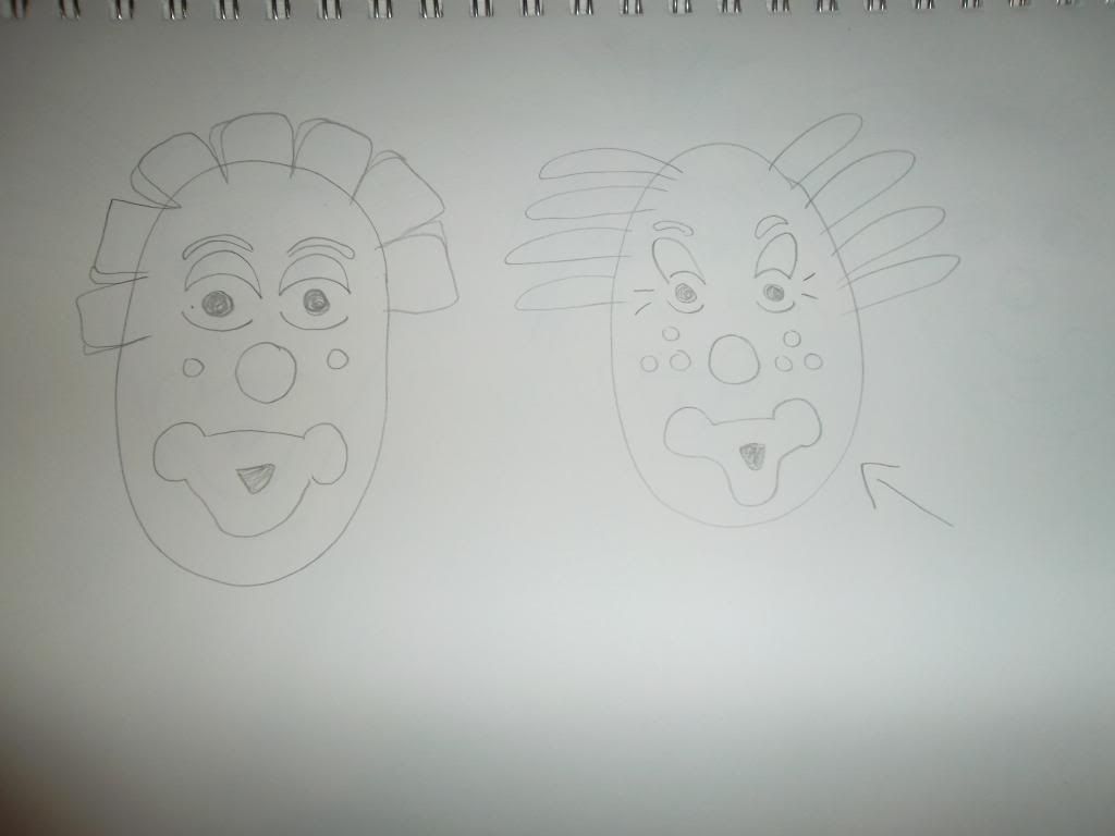
My Mask
I chose to create a clown mask. I chose the clown mask because my best friend is afraid of clowns and I thought it would be fun to scare her. I found three masks that inspired me. All three of the masks are also clown masks which is why i chose them. The clown is an important character in the La Fiesta de la Mama Negro. This is a popular celebration that happens once a year in a Quechua-speaking town close to Mt. Cotopaxi south of Quito in the center of Ecuador. Tourists are attracted every year with the unique customs and characters of the event.
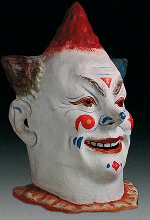
 The first mask that inspired me was made with papier mache. The mask uses thick bright red line around the mouth to indicate the lips of the clown. The mask uses, red, black and blue contour lines to indicate the eyes of the mask. The eyebrows are shown with thick to thin black line. This mask is symmetrically balanced, what is on one side of the mask is the same on the other.
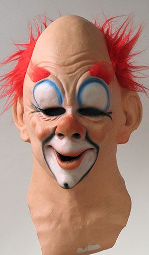
 The second mask i chose was also made with papier mache. This mask was in the halloween mask category. This mask also uses thick red line around the mouth to indicate the lips of the clown mask. The mask uses shape along with thick and thin lines to apply design. The hair of the mask also has shape. The mask uses the colors red, blue, yellow and brown. The mask itself is white. Contour line is used to outline the ears on the mask. This mask is also symmetrically balanced.
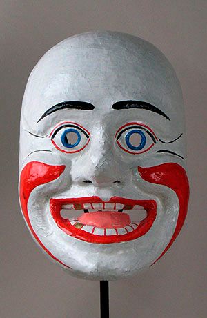
 The third mask i chose was created a full-head clown mask created with latex, paint, and artificial hair. The head-hair and eyebrows of this mask shows texture. The mask itself also looks to have a smooth texture, but the wrinkles in the mask look to have a rough texture. In this mask black line is applied around the lips to create a diamond shape, and the diamond shape is colored with white paint to give the mask design. Also above the eyes is almost a full circle outlined in blue and also painted in white giving a unique design around the eyes. The mask itself is tan or peach color and the nose, cheeks and lips are more of a salmon color. This mask is symmetrically balanced just like the other two.
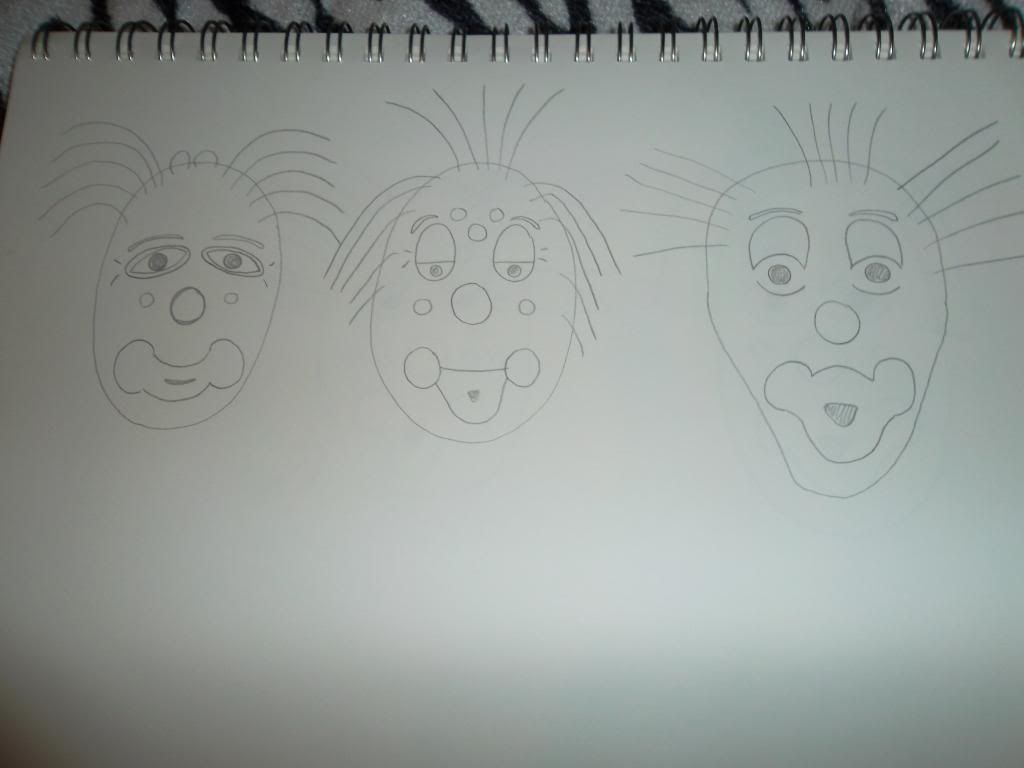
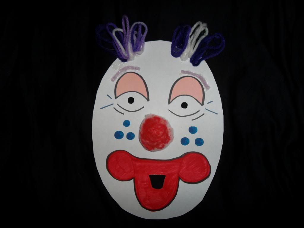
My mask was created with paper, a cotton ball, yarn, markers, paint and hot glue. The hair, eyebrows and nose give my mask texture. My mask has shape in the eyes, nose and dots on the cheeks. My mask has think red line to create the lips. I used thin contour line to create the eyes. The eyebrows also create line. My mask has the colors; purple, white, red, black, peach and blue. My mask is symmetrically balanced. I think creating the mask was fun. It took some time, but I felt like a little kid again creating arts and crafts. I think the mask turned out good, you can tell what it implies. My favorite part is the cotton ball nose because clown costumes has the red ball nose, and I think it really helps complete my design.
 The first mask that inspired me was made with papier mache. The mask uses thick bright red line around the mouth to indicate the lips of the clown. The mask uses, red, black and blue contour lines to indicate the eyes of the mask. The eyebrows are shown with thick to thin black line. This mask is symmetrically balanced, what is on one side of the mask is the same on the other.
 The second mask i chose was also made with papier mache. This mask was in the halloween mask category. This mask also uses thick red line around the mouth to indicate the lips of the clown mask. The mask uses shape along with thick and thin lines to apply design. The hair of the mask also has shape. The mask uses the colors red, blue, yellow and brown. The mask itself is white. Contour line is used to outline the ears on the mask. This mask is also symmetrically balanced.
 The third mask i chose was created a full-head clown mask created with latex, paint, and artificial hair. The head-hair and eyebrows of this mask shows texture. The mask itself also looks to have a smooth texture, but the wrinkles in the mask look to have a rough texture. In this mask black line is applied around the lips to create a diamond shape, and the diamond shape is colored with white paint to give the mask design. Also above the eyes is almost a full circle outlined in blue and also painted in white giving a unique design around the eyes. The mask itself is tan or peach color and the nose, cheeks and lips are more of a salmon color. This mask is symmetrically balanced just like the other two.


Saturday, April 6, 2013
Art Making/Material Exploration Drawings - Exploring Line
1. What was it like using your hand as subject matter for a drawing?
I enjoyed using my hand as a subject matter for a drawing. Hands have a lot of line and a lot of little detail. The lighting causes a lot of shade on your hands as well.
2. What media did you select - pencil or charcoal? Why?
I chose to use pencil because you can erase pencil so it is easier to fix mistakes. Charcoal isn't as easy to fix mistakes and knowing I had to draw with my left hand, I thought pencil would be a better idea.
3. How did it feel to create a drawing with your non-dominant hand?
It felt weird drawing with my left hand. I felt like I wasn't holding the pencil right and like I couldn't move the pencil where I wanted to. But the drawing wasn't as bad as I thought it would be.
4. Compare and contrast your final drawings. Do you think they are successful studies?
I think my drawings are okay, they could be better but they're not horrible. I found that my dominant hand is better with scale. My non dominant hand drew my dominant hand a litter smaller than it should have been. It was harder to draw a straight line with my non dominant hand. Overall I thought my drawing with my dominant hand of my non dominant hand was better.
5. Would you consider using your non-dominant hand to create artwork in the future?
No, I would not consider using my non-dominant hand to create art in the future. I don't like how I feel I don't have control over my non-dominant hand and I think my artwork turns out much better with my dominant hand.


Module 9: Video Reviews
1. Explain why you selected each of the TWO videos you choose from the selection listed above.
I was unsure of which videos to choose for this assignment. No title caught my eye, so I chose the two videos at random. The first video I chose was Albrecht Durer and the second video I chose was Velazquez.
2. For each video list/discuss the key concepts you learned.
In the video Albrecht Durer, I learned that he was arguably the greatest artist of the Northern Renaissance. His father was a successful goldsmith. His mother had eighteen children and buried 15 of them. When he was fifteen he became an apprentice for three years to a respectful local painter Michael Wolgemut. He was already skilled in making woodcuts. For four years he managed to survive as a traveling craftsmen. Within a year he published no fewer than four series of woodcuts.
In the Velazquez video, I learned that at age 24, he was named the quart painter to Phillip the 4th. Velazquez painted slowly and took things one at a time at a leisurely pace until he was sure of what he wanted to do. He was an educated painter. Velazquez believed that the purpose of painting was not to imitate nature but to guide the eye of the beholder to see what the painters eye has discovered.
3. How do the videos relate to the readings in the text?
The videos relate a lot to the text. Basically the same information is given. Just the text may be harder to follow or understand because you don't have the visual examples like you do in the videos.
4. What is your opinion of the films? How do they add depth to understanding of the readings and art concept.
I didn't find these videos to be too exciting. Im not sure why, may have had something to do with the narrator. But I always find the videos to be very informative. They always go very in depth and show great examples to understand the information. The films show sections artworks piece by piece and explain in detail what is happening, when in the text it is harder to do that.
Thursday, March 21, 2013
Module 8- Blog Video Review
1. Explain why you selected each of the three videos you choose from the selection listed above.
I selected the video More Human Than Human because it was required for this Blog assignment. I chose the Cario Museum video, because i've never heard of that museum and I thought it would be interesting to learn about the museum and see what types of things were inside. I picked the video Late Gothic Art and Art Architecture, because I thought the sound of gothic art sounded different and interesting and I am always interested in architecture.
2. For each video list/discuss the key concepts you learned.
More Human Than Human, I learned that humans made art and art made us humans. I learned that humans don't like realism. We exaggerate as humans because we don't like the way our body forms really look. We edit advertisements to make the human body look better to satisfy us. Images dominate our lives, they tell us how to behave, what to think, how to feel, they define us. But no other image dominates our lives like the human body.
In the film Cario Museum, I learned that the museum is located in Egypt and everything in the museum is about eternal life and death. It is filled with some of the worlds most precious artifacts. The museum is so large that only half of its pieces are shown at one time. These pieces are great visual proof for the archaeology, Egyptian history and art history. I learned that Pharaohs were buried with their treasures because they believed they would follow them to their afterlife.
Late Gothic Art and Architecture: England, 1400-1547 captures the transition from the Middle Ages to the Renaissance through architecture Gothic art is dark art. Every church at the close of the middle ages were filled with alters, stained glass images, colorful paintings. All these images had different functions. One thing in common to all the churches was at the east end, to each side of the altar there would be two images. The south side would be the virgin and child. North side you'd have the patronal image- image of the patron saint.
3. How do the videos relate to the readings in the text?
Both the video and the text teach us about the history of architecture. There was not too much in the book about the video Cario Museum, but for what was in common, the films were more in depth and easier to understand. Further extended the information given in the book.
4. What is your opinion of the films? How do they add depth to understanding of the readings and art concepts?
My opinion of the films is that they were boring compared to the other videos watched in this course. I may have found them boring because I don't enjoy history and I find it very hard to pay attention to. So it was hard to get myself to focus on the videos and not get distracted. Although I found the films boring, they were very informative and went in depth to complete anything misunderstood in the text.
Friday, March 15, 2013
Module 7- Video Review
1. For each video list/discuss the key concepts you learned.
Prairie Style (Frank Lloyd Wright)
In this video, I learned a lot about the famous architecture Frank Lloyd Wright and how he designed family houses. He built with bands layering of horizontals. He wanted his homes to reflect the time, place and landscape. Many people felt his homes felt claustrophobic because of how low the ceilings were. He also built his houses based on where the sun rises and sets. He wanted his homes to be private but not covered, and he liked his houses with a lot of windows. Frank Lloyd Wright built like houses they grew out of the sight, or belonged. He believed he was the best architect, and he proved himself to be right.
Architecture: The Science of Design
In this video, I learned about architecture and how it works. I learned a lot about skyscrapers. The structure of a skyscraper causes many problems. Skyscrapers are built with two parts. Superstructure which is the part about the ground, and substructure, which is the part built below the ground. Skyscrapers are set on concrete. With skyscrapers being so tall, wind causes the building to sway. The taller the building the more it will sway. Buildings over 100 feet tall can sway up to 1 meter. Architects can determine this with a computer. A poorly designed skyscraper can cause motion sickness, damage to the building and elevators to stop with high winds.
2. How do the videos relate to the readings in the text?
These videos relate to the readings in the text because, the videos basically say the same thing as the text. The video’s just go more in depth and have visual examples. For visual learners like me, it really helps you understand what you have read in the text.
3. What is your opinion of the films? How do they add depth to understanding of Architecture?
I enjoyed the films. I really enjoyed the Frank Lloyd right video because not only was I looking at pictures of his homes but I was actually able to see a 365-degree view of the homes they showed in the videos. I was influenced by his architecture and I can now say I have a favorite architect. The architecture video was good too, I knew tall buildings swayed in the wind but 1 meter is way more than I imagined. When they showed the building swaying it looked as if it was ready to snap. These videos were very informative and I not only enjoyed them but I learned a lot from them.
4. Why did you choose the films that you watched?
I chose the films I watched, honestly because they were the first two on the list. None of the titles interest me more than the others. But after watching the videos I am glad I chose the ones I did, because I really enjoyed them and who knows if I would have enjoyed the other videos as much.
Friday, March 8, 2013
Reviewing Peer Responses to Artwork
1. http://artaroundbuffalo.blogspot.com/
2. When looking at this persons first project, I thought they did excellent. They went above and beyond for the project and you can tell they put a lot of time and effort into the project. I enjoyed the pictures used for the project and thought they were very thought out and correct for each element. This person clearly understand the elements and principles of art.
3. When looking at this persons second project, I found this person used images that also interest me. We both said that Tauba Auerbach's "Untitled (Fold)" had an impression on us. We are both amazed with the way it looked like it was actually raised off the wall, but when you looked close it really wasn't. We both used Richard Anuszkiewicz's piece, "Temple to Albers" for our projects, but for different reasons. I found the piece interesting and would like to know more about it. But this person said they felt a connection with the piece.
4. Some of the images this person used I also had an interest in while I was at the gallery. But only choosing six images, i used other images instead. One of the pieces this person used that I enjoyed was Donald Judd's Untitled piece of 1969. I would love to have this piece in my home. Its interesting to look at and would really beautify a home.
5. After reading my peers reflection, I thought it was interesting to see another persons views on elements and principles. I also enjoyed having interest in piece of art as someone else and for the same reason. Makes me feel like I have a connection with some people in the class.
1. http://mdillonaed200.blogspot.com/
2. When looking at this persons first project, I really liked how she focused mainly on capturing outdoor images rather than indoor images. I think this person achieved her goal in this project. I don't see anything wrong with any of her images and I think she truly understands her elements and principles or art.
3. When looking at this persons second project, I saw that she two of the same images as I did for the project. We both used Phillippe Decrauzat's "Vertical Wave." But we used this image for different reasons. She said she would like to know more about the piece, but I said that the piece had an impact on me because I was amazed with the way it looked like it actually came off the wall. We also both used Marisol's piece, "Baby Girl" for the same reason. We would both like to know more about the piece.
4. One of the pieces this person used that I had an interest in was Sol LeWitt's "Wall Drawing." I stared at this piece the whole way up the stairs but didn't use it for my project because I could not find a label for it. I also noticed everyone else staring at the piece while walking up the stairs. It really attracts the eye.
5. After reading my peers reflection, I thought it was interesting that we both said the same exact thing about Marisol's piece "Baby GIrl." We both would like to know why the baby was so large yet the mother was so small. I also enjoyed seeing what other images she found interesting that I didn't really care for.
6. I thought the comments posted by my peers on my blog were very supportive. They made me feel like I was successful with these two projects. I enjoyed reading complements on my hard work.
Blog 6: Video Review
Through The Eyes of a Sculptor
1. List/discuss the key concepts you learned.
In the video "Through the eyes of a sculptor," I learned that the most popular types of stones are clay, bronze, marble and limestone. Also i found it interesting that different types of stones have different scents to them. I learned "Sculptors come alive in clay, die in plaster, and are reborn in marble." Clay hardens to get its shape. I also learned the steps in creating a sculptor. FIrst a clay model is created. Then a cast and last the plaster model is created. Creating a sculptor is a long process.
Glass and Ceramics
1. List/discuss the key concepts you learned.
I learned a lot in the video "Glass and Ceramics," Glass is made from sand, which is one of the most abundant surfaces on earth. Liquid is stiffened when it is cooled. I learned the steps of making glass. First you heat the mixture which causes the sand crystalized structure to break. Then it gradually hardens in the air until it cools. You can also use a propane torch to shape the glass. Glass and ceramics are some of the oldest man made materials. Ceramics are made from clay and come into existence with fire. Bricks, protective shields for air craft are ceramics.
Installation Art
1. List/discuss the key concepts you learned.
The idea of installation art came from Marcel Duchomp and installation art is art that takes over space. This type of art Forces the viewer to interact with the art. The video showed Art installations throughout Europe and many other examples giving me a clear picture to what installation art is.
2. How do the videos relate to the readings in the text?
After reading the text, the videos helped me understand everything much better. The text pretty much said the same thing but videos went more in depth with it. The videos were easier to understand because you were watching what they were doing, not just trying to imagine it. I'm a visual learner, that may be one reason why i enjoyed the videos more than the book.
3. What is your opinion of the films? How do they add depth to understanding of the topics: Sculpture, Installation, and Craft?
I enjoyed the videos and thought they really helped me understand sculptors, installation and crafts. The sculptor video showed a lot of images that helped me understand the process. I had no idea what installation art was until reading the book and watching the video. I enjoyed how the bed was created into art. Really put a thought in my mind to what other objects could be created into a work of art.
Sunday, March 3, 2013
Albright Knox
One artwork that made an impact on me was "Vertical Wave" by Phillippe Decracizat, because it made me think of an american flag by the way it looks as if it is a cloth blowing in the wind. I thought it was amazing that line could make something look like it is actually curved in and out when it is completely flat on the wall. This piece made me want to create a piece just like it. Another artwork that had an impact on me was Tauba Auerbach's "untitled (Fold)" because it looks like it is really a crinkled piece of paper on the wall. This was my favorite piece. I liked how the artist brought my eye to the piece with her choice of colors.
I feel a connection with the Charles LaBelle's piece "Manifestation: Three San Francisco Motels & Their Surroundings" because I have decorated my high school planners like this. I used cut out squares from online pictures and magazines creating a collage much like this one. This art piece connects with me because it brings back memories and it reminds me of artwork I have created myself. Another art piece I feel a connection with is Giacomo Balla's "Dinamismo di un Cane al Guinzaglio." This image makes me think of being rushed or in a hurry, and I feel like I am always in a rush or in a hurry. I am never on time or early for anything.
I would like to know more about Richard Anuszkiewicz's piece "Temple to Albers". I think it looks like the artist feels stressed and stuck. I see bars in this image and the orange color sends out a "stressful" feeling to me. I am curious to know if I am right. I would also like to know more about the piece "Baby Girl" by Marisol. I am very curious to why the lady or mother is smaller than the child. I would also like to know if the head of the baby is supposed to look like a pumpkin. This piece is very interesting and I would like to know the story behind it.
Monday, February 25, 2013
My Logo Design
1. Discuss what you thought about creating your logo.
I thought creating my logo was interesting and fun. I enjoy drawing especially something that represents me and the logo design was completely about me. I never realized I could actually create a logo for myself.
2. Describe the process: creative thinking skills and ideas you used in the logo creation.
I used trial and error when creating my logo design. I started out with drawing things that i love such as a lacrosse stick and basketball to represent sports. Then I drew a chicken wing and an ice cream cone because i love food. Then i worked out trying to fit the pieces together to make one design. After sketching out a bunch of designs I realized I could not figure out a way to incorporate the chicken wing into my design so I worked with the ice cream cone and the lacrosse stick. When I found a way to combine those two with my name, I found a way to bring it all together with the basketball. After I decided on my design, I had to decide on colors and medium. I chose to work with markers because I was looking to create thicker and thinner lines of sold colors in my design and I thought markers would work best for that.
3. What was the most important discovery you made in the creation of your logo?
The most important thing I discovered when creating my logo was that create a logo is not easy. Finding a way to bring the logo together as a whole was difficult. It took many steps and sketches to find what looked best.
4. What is the most important information you learned from watching the videos, powerpoint, and reading material for this project? What is your opinion of the videos?
The most important information I learned from watching the videos, powerpoint, and reading material for this project was that you don't need a lot of detail. The main idea is knowing what the design is and what it represents. A lot of the time, logos are contour drawings.
Monday, February 18, 2013
Value Scale, Color Wheel
1. Discuss what you thought about creating the Value Scale and Color Wheel.
I thought creating the value scale was kind of frustrating. I worked from black to white and when I first started, I felt like all my blacks looked like they were the same shade. But then after finishing the scale they seemed to fit in much better. Also I was very impatient when creating the value scale. I know that when using graphite, you should not press the pencil to make the shade darker, that will cause the paper to be shiny. You're supposed to continue to go over the graphite to make the shade darker, which I felt like took forever.
2. Which media did you enjoy working with the best and why?
I enjoy working with graphite more than i do paint, just because I feel like I have more control. Graphite erases and is easy to fix when you make a mistake. Paint is much harder to fix and when you try to paint over something too many times it tends to ruin that part of the paper.
3. What was the most important discovery in the creation of these studies?
The most important discovery in the creation of these studies was that cameras don't always capture color and shades the way you see them in person. My blue on the color wheel looked more purple in the picture than it did in person.
4. What is the most important information you learned from watching the videos for this project? What is your opinion of the videos?
The most important information I learned from watching the videos for this project was that the primary colors are not red, cyan and yellow. They are magenta, cyan and yellow. I knew blue was really cyan. But i didn't know that red was magenta. Also I learned that magenta, yellow and cyan mixed together make black. I always just used black paint or mixed dark colors together to make black, I never knew the primary colors actually made black. I think these videos are very informative for people who don't know how to mix colors or how to create a value scale. But having an art major in the past, I have already learned these things and I didn't need the videos.
Sunday, February 17, 2013
Slideshow: Principles and Elements of Art
This protect took me some time to do. I took pictures and changed them multiple times when finding something I thought would work better for a specific element or principle of art. After selecting my final pictures, I followed the steps on how to embed the album into my blog post. That part wasn't too hard, it was basically just reading and following directions. Although this project took me a while to complete, I enjoyed doing it. When taking your own photos, you have no choice but to understand the meaning of each element and principle of art. If we were to google a picture, we would learn nothing. We would just copy and paste the picture and not take the time to understand the element or principle thats in the picture. Therefore, this project taught me a lot, and I feel I completely understand the principles and elements of art.
Saturday, February 16, 2013
Blog 3: Color Theory and Emotional Effects
1. Describe Color and it's effects on emotions. Use the appropriate vocabulary of color in your posting.
Color connects to our emotions with its different intensity, values and hues. Bright colors tend to make us happy, or put us in a good mood. When dark and dull colors often make us sad, angry, scared or depressed. Thats why in scary movies the colors are very dark and dull, because it changes your mood. If they were to use bright and happy colors in a scary movie, you probably wouldn't be as scared.
2. What is a theoretical aspect of color that most intrigues/fascinates you? Why?
The theoretical aspect of color that most fascinates me is how colors can effect our moods. Its amazing how that works. If you're looking at a painting of a rainbow, flowers and butterflies you're going to be in a better mood than if you're looking at a painting of a dark empty room.
3. In the Color video, what made the biggest impact on you in regards to color and it's effects on emotions?
The biggest impact the color video had on me was how June was getting so angry with her painting. She reminded me of myself. She was angry because the colors weren't giving the right feeling. June said the colors were making the mood of the picture violent, and thats not what she wanted.
4. In the Feelings video, what made the biggest impact on you in regards to color and it's effects on emotions?
The biggest impact the feelings video had on me was the "Mono Lisa" painting. Da Vinci created the "Mono Lisa" with a mysterious glow around her. I believe without this glow the "Mono Lisa" painting would give off a different feeling. The slight smile on the "Mono Lisa" also changed the mood of the painting. The smile and the glow together often made people smile while looking at Da Vinci's painting.
Thursday, February 7, 2013
Blog 2
1. For each video and article list/discuss the key concepts you learned.
The first video talked about all the philosophers and their theories on aesthetics. The different views on the beauty of art. The second video talked about the science of aesthetics and how the human brain develops. This film connected art with biology.
2.Which philosopher's theory on aesthetics do you feel is most important? Be sure to mention the philosphers name, era (time in history), and contribution to the aesthetic theory in your response.
I feel that Immanuel Kant's theory on aesthetics is important. Immanuel Kant, an 18th Century philosopher believes that it is our judgment of taste that allows us to find beauty in art. That art is not beautiful from what we see, but by the way it makes us feel. Immanuel said "No one could teach someone how to create a masterpiece" This is because no one can teach someone how to feel, its the feelings you express in a work of art that makes it beautiful.
3. What do you think about Changeux and Ramachandran scientific view of aesthetics and art? What was the most interesting fact you discovered from each speakers lecture?
I think Changeux's speech was boring and hard to understand with his strong accent. But I did find it interesting that skulls were being used as tools. I think its kind of gross, but interesting. Ramachandran's speech was more interesting and easier to understand. I think I got a lot more out of his speech. I found his "eight laws of aesthetics" interesting. How much the brain is used in the critiquing of art.
4. How do the videos and article relate to the readings in the text?
The first video relates to the text a lot. They both talk about the different artworks and the meanings of aesthetics. But the video goes more in depth of the philosophers theories on aesthetics. The second video doesn't relate to the text as much. This video talks more about the brain and how science is brought into the beauty of art. The text doesn't talk about the brain and the biology involved in the aesthetics of art.
5. What is your opinion of the films and article? How do they add depth to understanding of the topics in your reading in the text?
I think the films and article were very informative. I never even heard the word aesthetics before this assignment, watching this video and doing the readings. The videos were kind of long, and hard to sit through but thats because they were into depth and were very detailed. The videos went in depth on who each philosopher was, their aesthetic theories, and where they were from. The second video went into depth on how the brain works and comes into place with art. If I were only to do the readings and not watch the videos I would barely understand the meaning of the word "aesthetics" the philosophers theories. The book mainly focuses on the art pieces themselves.
Monday, February 4, 2013
Post #1
The process of creating the gmail account was easy. It was just like setting up any email account witch i've done multiple times. Setting up the blog was a little confusing at first but not too hard to figure out. In this course I expect to learn about artist and their artwork. What an artist was feeling or thinking when they created such work and why they created it. I am very excited about taking my first online course. I am ready to experience something different, and I guess I will find out weather it's for me or not.
Subscribe to:
Comments (Atom)